As I was applying to jobs on the East Coast of the US during my senior year of college, I began to do research if there was an optimal place for me to live. I looked into livability, economic, education, and loads of other data to join together. I created a scoring matrix to rank cities using the Technique for Order Preference by Similarity to Ideal Solution (TOPSIS) with varying weights of how much I cared about each factor from the data. I used the Bureau of Labor Statistics to look at industry growth and pay in different cities and cross referenced that with the rankings. I also wanted to understand how affordable different parts of the country were, the final question to help me understand where might be the best place to live. (View Highlight)
I have been budgeting and tracking my finances for a decade now using Excel, so I’ve learned quite a bit about my spending habits and where it’s easiest to save money. Housing is the biggest monthly expense everyone faces. If you’re a shop-aholic or eat out every day, sure you can save a lot by cutting back there, but nothing will save you more than if you move to a cheaper apartment/house or live with roommates. (View Highlight)
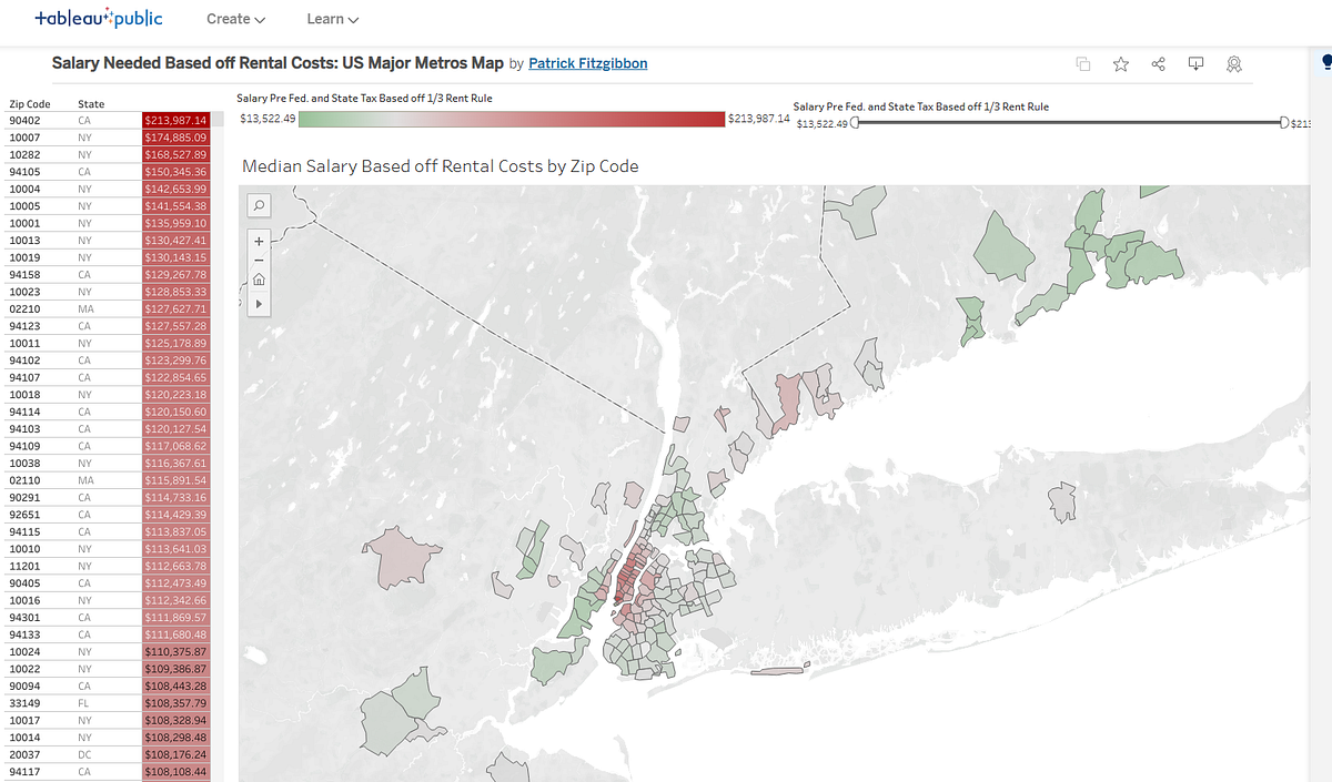
I’ve always had roommates, at least 1 other and at most 3 others. Through that I managed to keep my rent under 1kforabedroomformostofthelastdecade.Ifyouwanttosave200-$1k a month then find a cheaper apartment, get a roommate or 2, downsize, move to a less in demand neighborhood, or do all of the above. This is why I made this dashboard, to help quickly assess cities to figure out which neighborhoods were affordable so I could find a place to live that would help me save the most. (View Highlight)
I designed the dashboard to be focused on the map view of the data, since the main goal was to visualize cities and neighborhoods and quickly show what’s affordable and what’s not. I chose salaries as a way to detail affordability because I was job searching and wanted a way to conceptualize what salary to expect and/or negotiate for. I hard coded in the 1/3 housing rule, that people should only pay 30% of their salary to housing costs. I hard coded this at 30% of the post-tax salary, when in reality most say 30% of your pre-tax salary. I chose post-tax because I always push myself to save more than what’s recommended. (View Highlight)
I only used one dataset for the housing data, Zillow’s available data on 2-bedroom apartments and their rent prices. Now I would use data for all number of bedrooms and for both renting and buying. I would build into the dashboard the ability to select renting or buying as well as the ability to select the number of bedrooms as 1 to 2-bedroom units are typically more expensive per bedroom than units with more bedrooms. (View Highlight)
I might stick with using Zillow as the data source, or I’d choose a different site as going through a company runs the risk one day they turn off access or put the data behind a pay wall (which Zillow seems to have done now). I downloaded the data from Zillow originally, but now I’d connect to an API to source live data. A number of sites offer this, but Zillow still seems to offer the most affordable API options. Although further research would need to be done to assess which API contains the most data across the US and if multiple APIs need to be connected to fill the data gaps. (View Highlight)
The initial dashboard used housing data for 2-bedroom apartments and I factored in that I’d only be paying rent for one of the bedrooms, meaning I’d have a roommate to cover the other. To make the new dashboard more customizable to the user’s preferences, I’d have this be a feature on the dashboard where the user can enter in the number of roommates that would be contributing to the cost of housing. Using that language since you might live with your spouse, but maybe they don’t work and don’t contribute to paying the mortgage or rent. (View Highlight)
There are a lot of other factors to include, is water paid for through taxes? Does the town allow you to choose where your electricity is sourced from? Do you include the cost of internet in utilities? Utilities is thus highly variable, and next-door neighbors can pay very different utility costs based off their life style choices. In redoing this dashboard, I’d use an average based off what data is available for each neighborhood/town/state and only include electricity, internet, water, and gas costs. Some of this data can be found on the US Energy Information Administration API. (View Highlight)
The salaries are pre-tax based, but due to states having vastly different tax brackets, I used the average state tax rate for earners over 45k(Ihadthought45k was a reasonable salary estimate for a college grad). A solution I would implement now would be to map each state’s income taxes to the salary calculation, including cities as some cities have their own income tax as well. This wouldn’t be the easiest feature to add since each state and city do income taxes differently, with some having a flat rate and others having brackets like federal income tax. Sites like PAYCOM can help, but current data via an API would be more helpful, albeit harder to find. (View Highlight)
Interest rates have a huge impact on the cost of owning, taking what could be affordable and making it far out of reach, thus it’s very important to have accurate interest rate data for this dashboard. Current and historic mortgage rate data can be sourced through Zillow or API-NINJAS. In the hover over tooltip I’d include a best case/worst case salary for variable rate mortgages (based on historic rate fluctuation) and a potential needed salary for if a remortgage was done later (based on historic rate fluctuation and the likelihood of rates dropping far enough to make it worth it since it costs money to remortgage). (View Highlight)
The salary data is not a data source, but a calculation and in redoing this dashboard I’d change how the salary is calculated. The salary calculation would need to be updated based off the inclusion of all the new data listed above. I’d also include the ability to enter in what rate of your salary you want going towards housing, with 30% as the default. I’d also have an option to select whether you want that to be applied to the post-tax or pre-tax salary, with pre-tax as the default since that is the common advice. (View Highlight)
In the original dashboard the only prediction related data included was the historic rent percent increases. This tells the history of a neighborhood, but not necessarily its future. Like stocks, I’d add to the dashboard tooltip the performance over the past 1, 3, 5, 10, and 15 years (when available). (View Highlight)
I’d want to include a predicted future growth rate (detailing the confidence level in the prediction) for either 5 or 10 years into the future. Now this would only be possible if I can create a machine learning model that can predict accurately 5 or 10 years out for a neighborhood, and I’m sure some neighborhoods might be more predictable than others. A model like that might require much more data, not just historic data going back 50+ years, but also data on local politics, jobs, schools, and so many other factors as so much can impact the trajectory of a town. (View Highlight)
The goal of all these updates is to provide the tools needed to find the neighborhood where you can accomplish your saving goals. Many Americans move all over the country for better salaries or cheaper housing, so this redesigned dashboard would help ease that search and help make budgeting easier for individuals and families. (View Highlight)